Tuesday, February 1, 2011

XML Slideshows

Ingredients & Method:

In a folder place
1 file labelled 'images' in which images required for slideshow are place
1 xml slideshow file ('slideshow.xml')
1 flash file: ('slideshow.fla')

When you load the flash file the slideshow should play.

How do you create these files? Do you find them online depending on what application (slideshow) you need them for? Is there a way to create them from scratch?

XML stands for extensive markup language. I need to find out more info about what XML actually is!


Wednesday, December 22, 2010

Blender Project- Ernie the Sea Serpent


Ernie, my Sea Serpent
Goal for the Assignment:

The goal was to create a rendered 3D image worth 30%. I assumed that it had to be coloured as well as placed in a background.

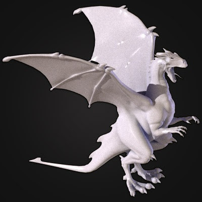
Originally, I decided to create a dragon. However, due to time constraints as well as my limited (though ever-expanding!) knowledge of Blender, I decided to create a Sea Serpent instead. I call him Ernie.

Ernie was created though trial-and-error, as well as by following several internet tutorials.

I spent about a week creating him, devoting hours in both day and night to this project. I've literally only left my house twice during that time! I think it's worth it, though.

These tutorials were particularly helpful:
http://www.blenderguru.com/the-secret-to-creating-realistic-grass/ (This helped with lighting and determining the angle of the camera).

PROCESS:

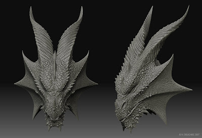
First off, I had to look at pictures of dragons in order to gain an idea of basic shape. I also referred to the tutorial on creating a stylized dragon above, but I made changes and alterations as I saw fit. I did not want my creature to be an exact duplication.

These pictures of dragons helped to inform certain aspects of the dragon's features:

They were very helpful. As you can see, initially my sea serpent began to look much like a cow:


I realized by referencing these pictures, for instance, that dragon's horns tend to be flatter and sleeker, while bull's horns are more curved. This is why the final Sea Serpent's horns are shorter and more sloped; this makes it look more realistic.

I of course also used the dragon in this tutorial as a reference.

So basically, I worked in Blender with very little knowledge. I realized I had forgotten most shortcuts and how to perform even the simplest functions.

These are some of the things I learnt about Blender while working on this project:
  • The number keys rotate the project and give different views along various axes; this helps when you need to see a particular view of the model very quickly. For example, 3 gives you a view of the side; 7 gives you a view from directly above.
  • That holding down shift while holding down the middle button on the mouse allows you to shift the entire view from side to side. This helps when you need to focus on a particular area in the model to attend to detail, for example.
  • I learnt about using the mirror modifier, which assisted in gaining a symmetrical dragon figure.
  • I also learnt about using the sculpt tool. In particular, I heavily relied on the grab, smooth and flatten tools; as the dragon's body is smooth, long and sinuous, the smooth tool especially assisted in giving the vertices smooth curves.
I also learnt that modelling the figure is simply half the battle; it must then be textured, placed in a world, and then the camera must be adjusted to take a picture that can be rendered. 3d animation takes a long time!

The figure was both box-modelled as well as modelled by using the sculpting tools.

I ended up with nearly 30 versions of my model. I saved nearly after every step, which was helpful in avoiding losing my work.

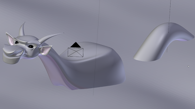
I also discovered that you can render pictures of the viewport. Here is a picture of my unfinished model:


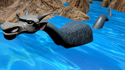
Of course, I had to create a background to place the dragon in; I created waves by making a plane, subdividing it, and increasing the 'fractal' tab so as to create an undulating pattern; I created mountains by extruding and using the proportional edit tool as I learnt in class.

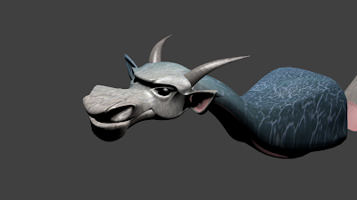
Hunting for textures was another quest. Because I decided to make a sea serpent instead of a dragon, I decided to look for reptile textures. I tried several on the figure, rendering each time. When I couldn't find any that satisfied me, I looked for leather textures instead. I found this one that worked quite well, and tweaked it a bit in Photoshop:


I found out through trial and error that if the corner of the texture was lighter, it would result in a lighter face on the model. I wanted the dragon's face to be lighter than his body in order to add dimension, so this is why I tweaked the texture in Photoshop.

Additional textures were sourced for the rocks and the sea.

I actually painted parts of the sea serpent manually; his ears and underbelly, for instance, are pink while the rest of him is blue. I did this by selecting the faces and assigning a different texture to them so that the sea serpent would have some detail.

More shots of the dragon in progress:


I'm glad he is is finished because I can finally get some sleep.


Monday, March 1, 2010

Flash! Ahhhhhhhhh

So recently we've been working with Adobe flash.

Flash isn't as fun as I thought it'd be- or at least, not fun yet- because it actually takes some really hard work.

Things I learnt using Flash:

1. Drawing in Flash is not the same as drawing in Illustrator. Drawing in Flash is vector-based as well, but you can do some things in flash that you can't do in illustrator, and vice versa.

You still work with layers in Flash, but the process of selecting a path is different- you don't really work with manipulating points as Illustrator does; you can really just move segments of a line by clicking or selecting portions of the line itself. Manipulating a shape, therefore, when you've already drawn it in is a lot different. One thing you can do in Flash that you can't do in Illustrator, however, is segment or erase a shape by placing another on top of it, clicking on the board, and dragging away.

All in all, you can simply import images you've already created in Illustrator, so I may do that until I become proficient in drawing in Flash.

2. New Terminology
Key frames: A key frame is a frame in which a change happens, for example when a figure is supposed to move or a picture is supposed to change- keyframes therefore allow for animation or movement in flash.
Tweening: is generating intermediate frames between two images to create the appaearance that the first image evolcves smoothly or moves into the second image. It isn't done manually with the addition of frames but rather automatically by selecting the frames you want tweened and then selecting a button which allows the program to do it. Motion tweens, for example, allow one image to move in a specific direction and to stop in a specific place.
Pretty cool videos others have made using flash (Inspiration):


Sita Sings the Blues is a movie made entirely in flash by one person- the American Nina Paley. It's the Hindu story of Ram(a) and Sita re-imagined in a completely contemporary way. Pretty cool.

Others to come!

Tuesday, February 16, 2010

Hard work!


So last week, I holed myself up in my room and worked on my C.V., as well as followed internet tutorials to help me learn new techniques to build my portfolio.

I'm nervous about internships because I feel that, if I go abroad again on a multimedia internship this time, I won't know enough about web design and graphics to perform at the level they expect. This could all be paranoia, by the way. For all I know, I could be exactly what they're looking for. But I'm a perfectionist (sometimes to my own detriment) and I will not stop learning and preparing until I think I'm ready. So there.

In the U.S., I'm aiming for TOMS and Pixar.

This is a random selection of stuff I'm working on:

Logos to build my own form of corporate identity, as suggested by Nubby Twiglet:

The 'more professional' one.


The 'cooler' one.

Character design (esp. thinking about Pixar here), following tutorials by Vector Tuts:
Hell, I've even been working on images for my soon to be established clothing line, which I'll def. be including in my portfolio (See first pic above).

So yeah, lots still to be done. I think this is becoming my motto. Not sure if I'm happy about that.

Monday, February 15, 2010

Building a website using wireframing

Can you believe that this is the THIRD time I am writing this? I always have a bajillion tabs open at once and when I'm closing some of them, I always accidentally close the one I'm working on. SIGH!

Anyway, in class we learnt about attention-mapping and wire-framing. Both are techniques which are used to assist in laying out a page effectively to achieve particular goals, namely usability, and in the case that the site is used to market a good or service, the purchasing of the product!

In class, we used attention-mapping in order to rank each element of a fictional dog grooming site in terms of what would 'best help to put food for grandma on the table' (love my multimedia class), and then we used this website, Go Mockingbird, to assist in wire-framing, which is the actual physical process of laying out each element on a page and deciding where each should go, how big each should be, etc etc.

I'll admit that when planning my version of the dog site, I worked backwards. I'd already envisioned the way I'd like it to look based on some sites I frequent that sell goods/services that I think are already very well-designed. Examples of these are 3rd Ward (awesome art facility in Brooklyn that hosts the best events, like Wednesday's Drink n Draw), and the clothing sites Nasty Gal Vintage, Style Stalker and Shop Cuffs (see? shopping can be educational too).

What I noticed for all these sites is for the homepage, there's always a really huge attention-grabbing picture as the main focus, which advertises the site by showing which promotions or events are currently happening to grab potential customers. Our class rated sales/current events as pretty low on the list of information to be displayed, but I disagree, as even before a person knows much about a product, he/she'd like to know whether it's affordable, or what events the company is having that he/she can go to that are possibly free, before they click further on into the site to only waste their time.

Something we didn't talk about in class that I learnt during my internship at BurdaStyle is how much internet businesses value the user's clicking habits. They use programs like google stats to see whether a user 'bounces' off the first page, or which pages they continue to on the site before they lose interest. This is especially important if the site is going to earn you revenue (through google adsense, for example).

A homepage is tricky business, therefore, as it plays special importance. You want enough information there in order to pique interest, but you don't want too much so that the reader will glance and become overwhelmed, or won't be tempted to navigate through the site and be convinced by doing so to purchase the service. Usability is also super important, otherwise the potential customer will become frustrated and decide to go with another service.


In the end, I decided that if I were building a site, I'd go with 3rd Ward's idea of using a flash banner to display any exciting promotions/events which are ongoing or coming up to first lure the potential customer. I'd make the first frame a picture with a very brief (2 lines at most!) description of what the dog grooming service is, exactly, and it would be clickable so that the other pages lead to the exciting sales/promotions offered on the site. I'd have clear instructions for how to use it, "click on the arrows to see more events!", because it would make the site more user-friendly.

Woo this post was long, that's it for now!

Monday, February 8, 2010

Back to School- Back to doing Web Stuff

So I'm back to Mr. Bain's class again and we're customizing navigation toolbars. This process isn't really that fun, but it will be useful when we're designing websites and blogs. So I'm trying to pay attention and absorb as much knowledge as I can.

I started by designing tabs for a horizontal menu for my personal blog, Muthafuk. I used a pretty basic template I got online and customized a bit leaving it intentionally minimal, but I figure it could use some sprucing up with some pretty buttons.

We started out by trying the 'sliding doors' technique of menu bars. Exploding Boy gives some good examples as well as A List Apart.

I created my own tabs in Illustrator following Exploding Boy's examples:

I don't really like drop shadows, but I experimented just to see how it would turn out. I'm a really huge fan of the font I used, the sleek, simple Bebas. So the whole point of using 'sliding doors' is that the CSS code pushes the top about tab beyond some invisible border when he mouse hovers over it, so it looks as though the black about tab is morphing into the pink one. Or at least, that's the hope.

After copying and pasting code from Exploding Boy's blog, and especially with the padding (also with a lot of Mr. Bain's help), I finally got something that looks like this.


Lots of corrections to be made, but it's a start. (Click on the pic for the bigger version).

Sunday, November 29, 2009

It's Been a While


It seems like a lot has been going on since I last posted in this blog! We're on to building websites now, and if I thought photography was challenging- boy, I was so wrong!

We're learning the fundamentals of Html and CSS in order to build a website as our last assignment. I'm still trying to figure out the difference between both types of codes, so I'm posting some research here for the sake of my sanity.

HTML and CSS
According to research and class notes, Html or hyper text markup language was originally created to format or to display the content of a page, for e.g., by using basic tags such as

to show a paragraph or to make text bold. It wasn't necessarily created to code complex design elements. Though these elements (like tables, for eg) can be created with html, it presents a challenge for the web designer who must then code each page separately in html, especially for very large websites. CSS, or cascading style sheets was the solution. With one page of CSS code multiple pages of html can be formatted and displayed according to a similar 'theme' of the website. Html therefore seems to deal with organizing content while CSS deals with the visual and stylistic elements.

My Website- Inspiration
I'm in the process of building my website. Here's a list of websites/graphics that are sources of inspiration:
  • Nubby Twiglet- like the typography and sharpness of layout. Also colour scheme.
  • American Apparel- Yes, everyone's got something to say about the controversial sex-driven clothing company, but they've got good models with great poses, as well as cool clothes. I'm incorporating some computer drawn and hand-coloured models on the front page of my site that will be inspired by the American Apparel aesthetic. Of course, with a twist that makes it uniquely mine. It's gonna be awesome!
  • Jasper Wong's portfolio- Like the colors, navigation, and style of artwork. Also simplicity of layout.